Pfizer
As associate director of UX, I shaped the merge of two Pfizer patient sites into one responsive arthritis.com, delivered in four phases. Bounce rate fell from 60% to 33% year over year, and visits grew from 4 to 6 minutes.
- Role
- Associate Director of User Experience
- Team
- Copywriter, UI Designer, Data Analyst, PM, Account
- Engagement Length
- 2 years
- Tools
- Sketch, Photoshop
- Pfizer
- Arthritis.com has a mission to help patients take control of life with arthritis by creating a home for arthritis education, empowerment, and support.
- Arthritis.com is an unbranded website with a focus on patient empowerment via condition and lifestyle content. The site caters to both naïve and experienced audiences with the main aim of producing qualifying leads and feeding branded CRM for Xeljanz, a small pill that treats moderate to severe rheumatoid arthritis. Registration is a key component of connecting unbranded and branded CRM efforts by Pfizer within the Xeljanz ecosystem.
Problem
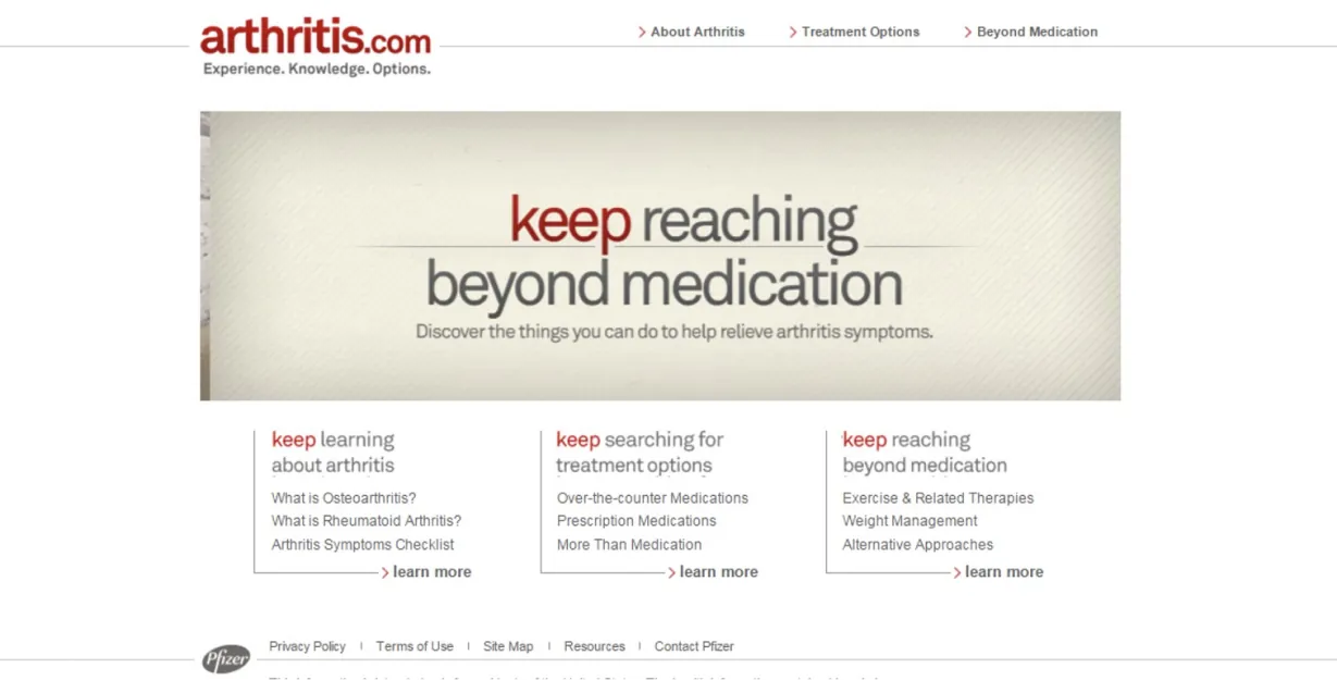
Pfizer ran two unbranded sites for the same audience. arthritis.com was dated but drew strong organic traffic and engagement, yet did almost nothing to promote Pfizer’s branded site: one banner on one internal page. rethinkra.com offered an unbranded support kit.
Pfizer asked us to rebrand arthritis.com, fold rethinkra.com into it, add lifestyle content and key influencers, and link the audience to the full range of Pfizer resources, from disease education to progress trackers.
Outcome
We delivered in four phases to ship sooner. The merged site met the FDA’s fair balance guidance, featured lifestyle influencers from the RA community, and organized everything around three themes: education, empowerment, and support.
- One platform made the media buy more efficient.
- Lifestyle content lifted engagement.
- An unbranded email program kept the audience in touch.
- Responsive pages removed accessibility barriers.
- A suite of interactive tools backed Pfizer’s commitment to every patient.
- bounce rate, down from 60% YoY
- 33%
- duration of the visit, up from 4
- 6 min
Why are we doing this?
Business Side
Empower patients to engage in a proactive dialogue with their Health Care Providers.
Improve broad awareness of xeljanz.com to ensure patients understand the total value proposition.
Merge web properties to ensure efficient paid media spend.
Become a trusted source for all arthritis education.
Customer Side
Patients are overwhelmed by the volume of information and resources and have trouble finding answers to specific questions – especially at the point of diagnosis.
Patients also have difficulty communicating with loved ones and health care professionals about their disease as it is considered to be a "hidden" disease.
Patients also lack lifestyle advice that could help alleviate their symptoms and help them cope with their disease better.
Discovery
I audited both sites for UI consistency, navigation and information architecture, content, usability, and performance. Among the findings, neither site supported mobile at all.
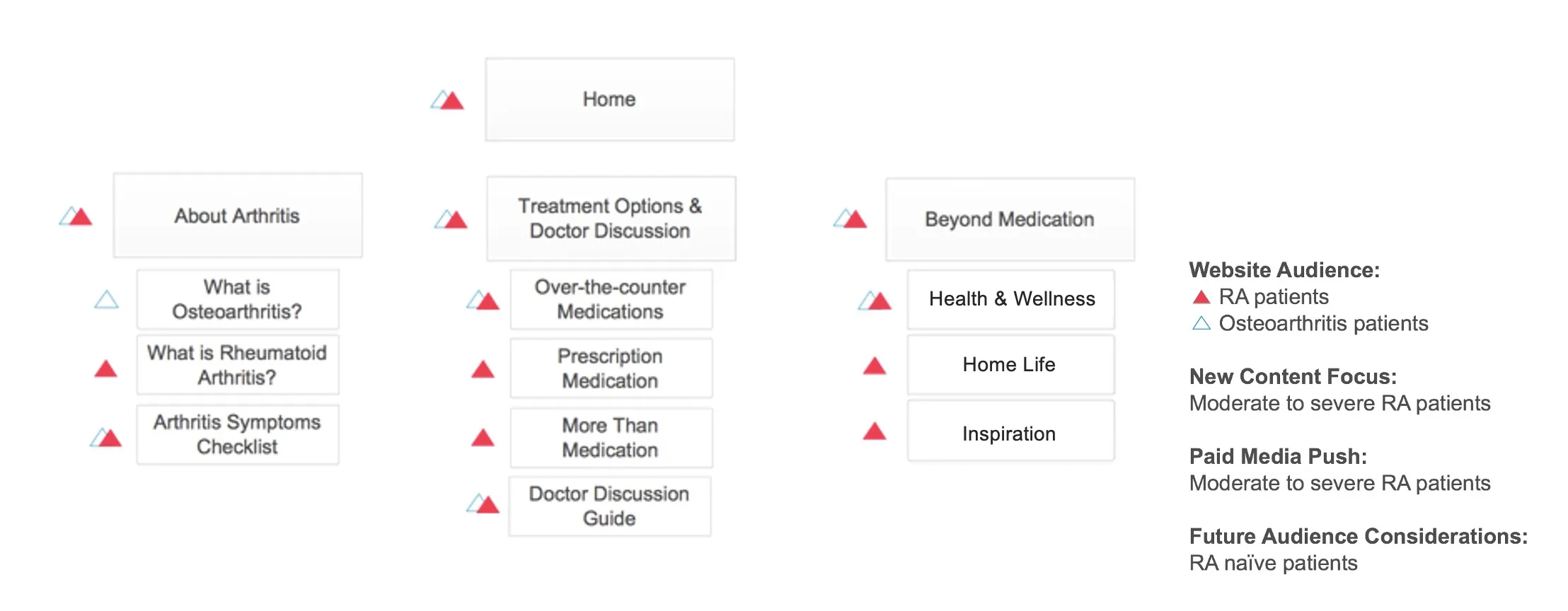
With a copywriter, an analytics specialist, and a strategist, I took the findings into a content workshop with the client to agree on the key themes and the new site’s goals.
Content Map for Phase 1
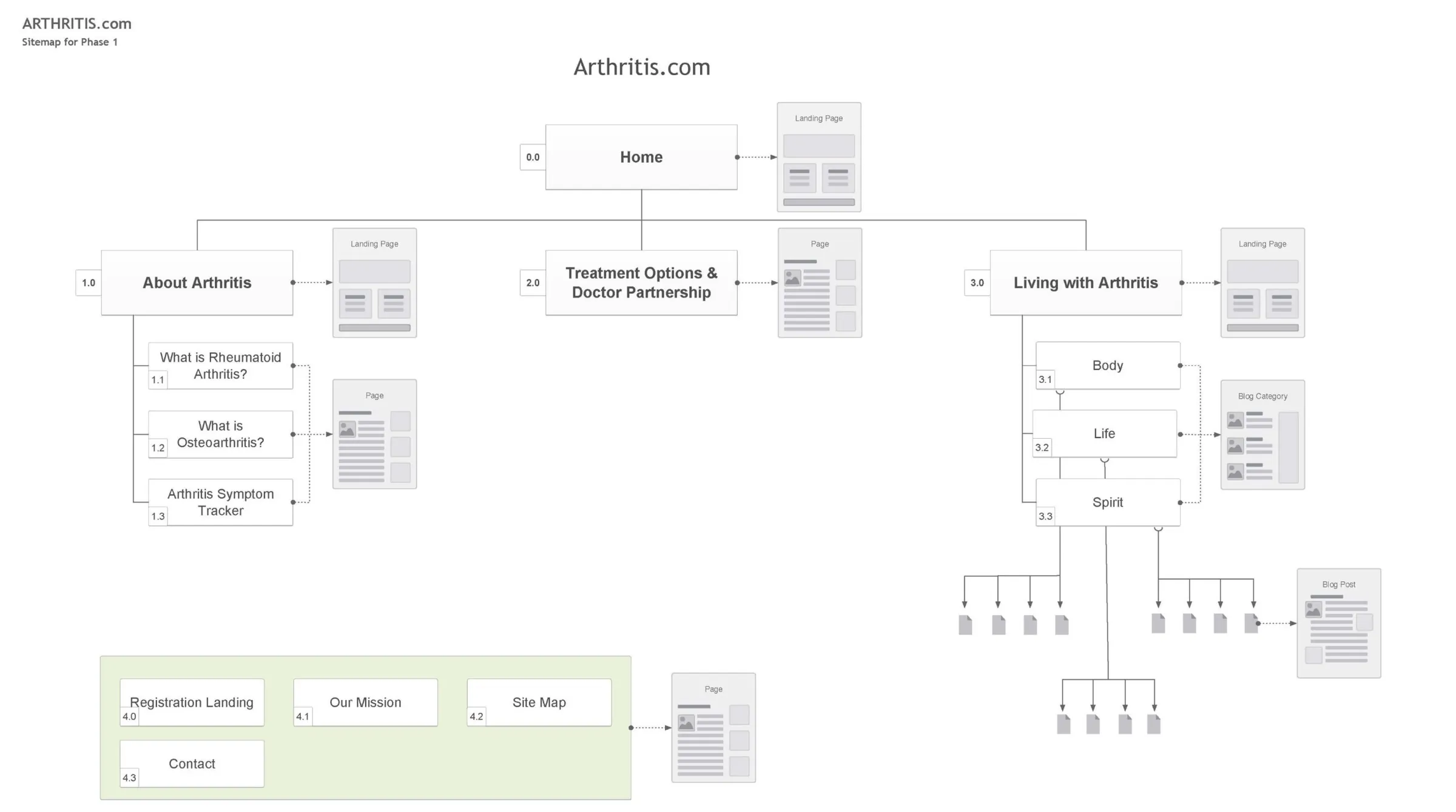
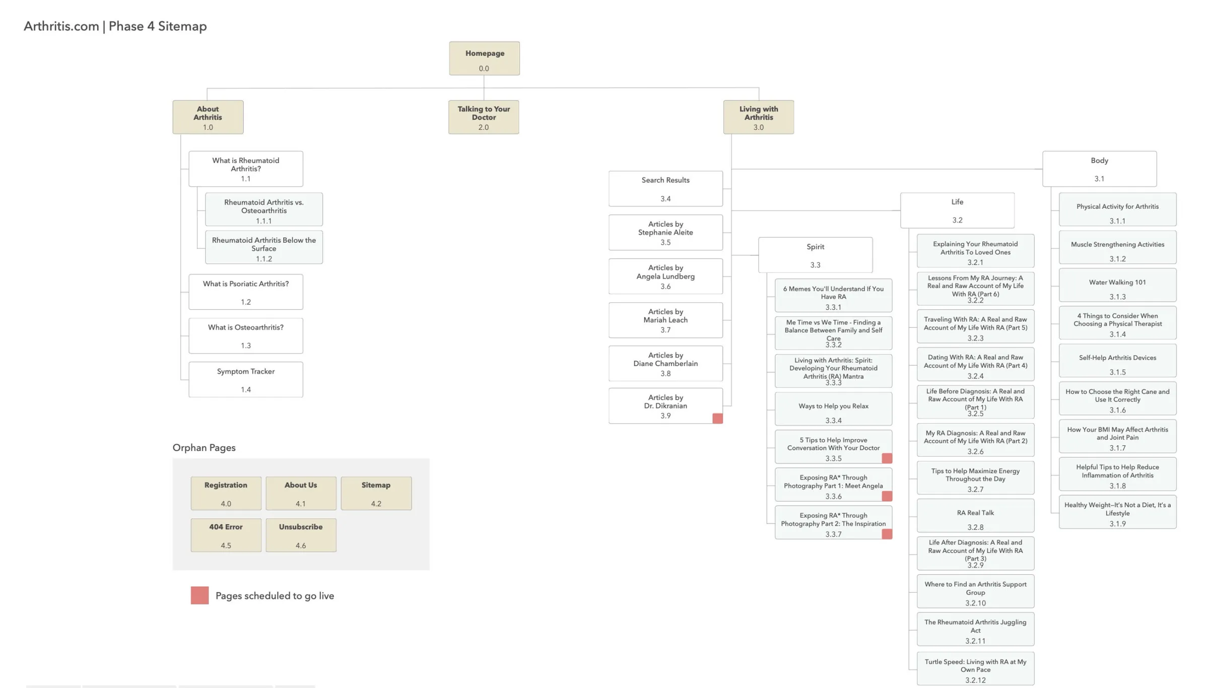
Information Architecture for Phase 1 and Phase 4
Mobile first approach
Once the client approved the sitemap, I organized the content, flagged where new content was needed, and updated existing RC-approved content. I used real content wherever possible to avoid complications in RC review.
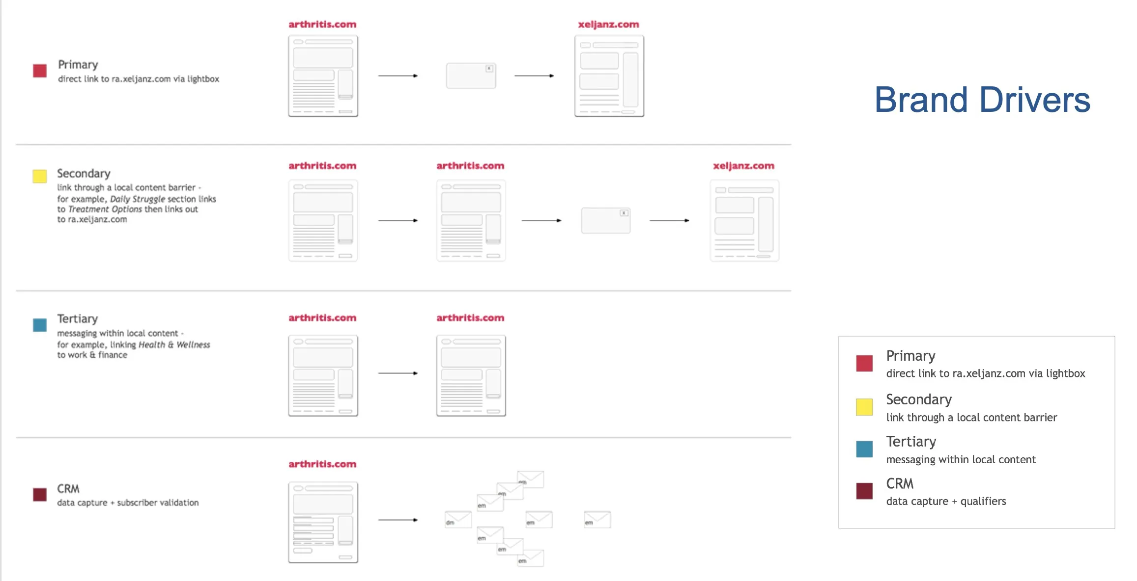
I wireframed the full mobile set first, then mapped the brand drivers so copy, design, and strategy pointed to the same links.
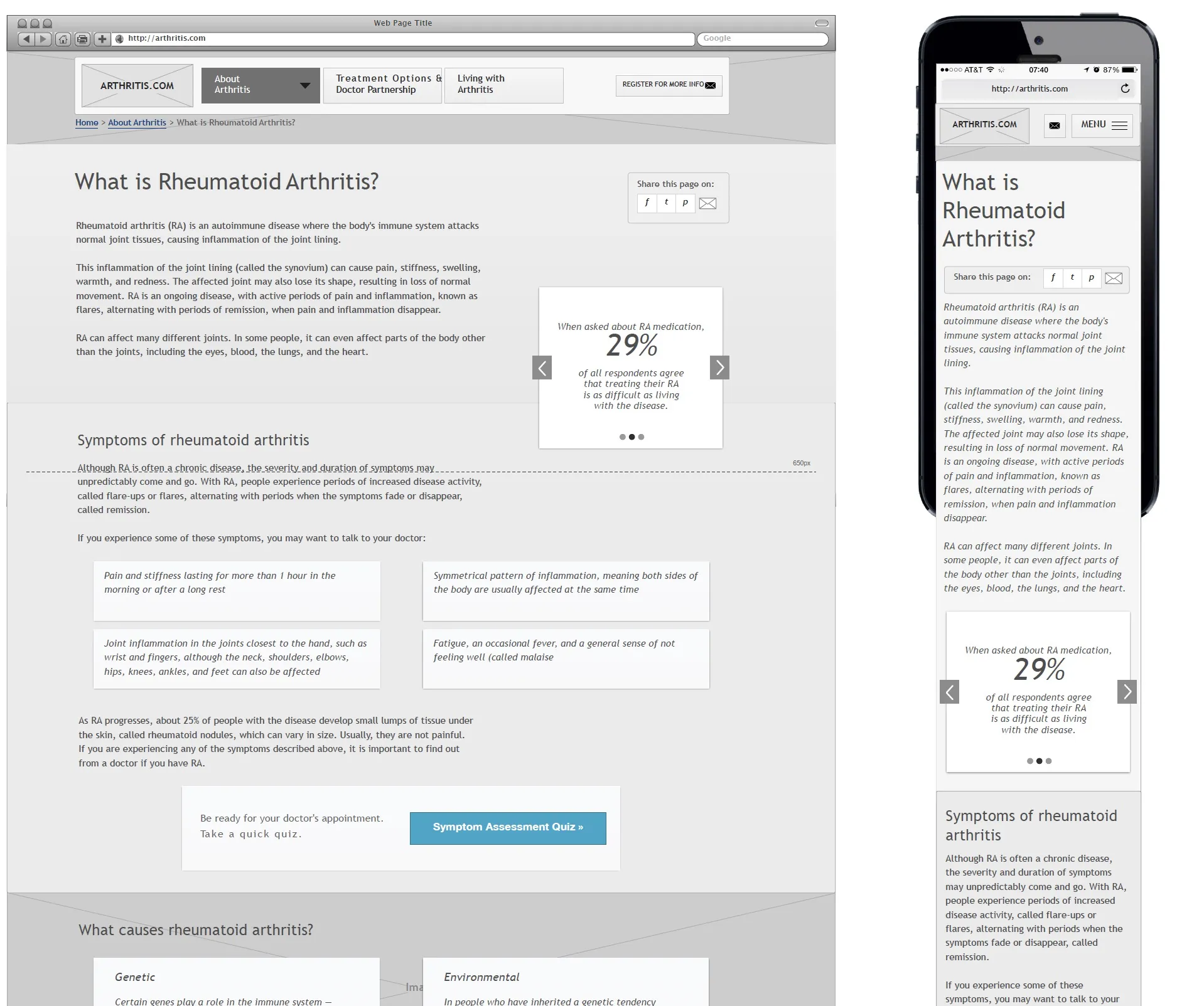
Working with Design
Once the full set of wireframes was delivered to the design team, I streamlined all components to ensure consistency, with a focus on simplifying development and future maintenance.
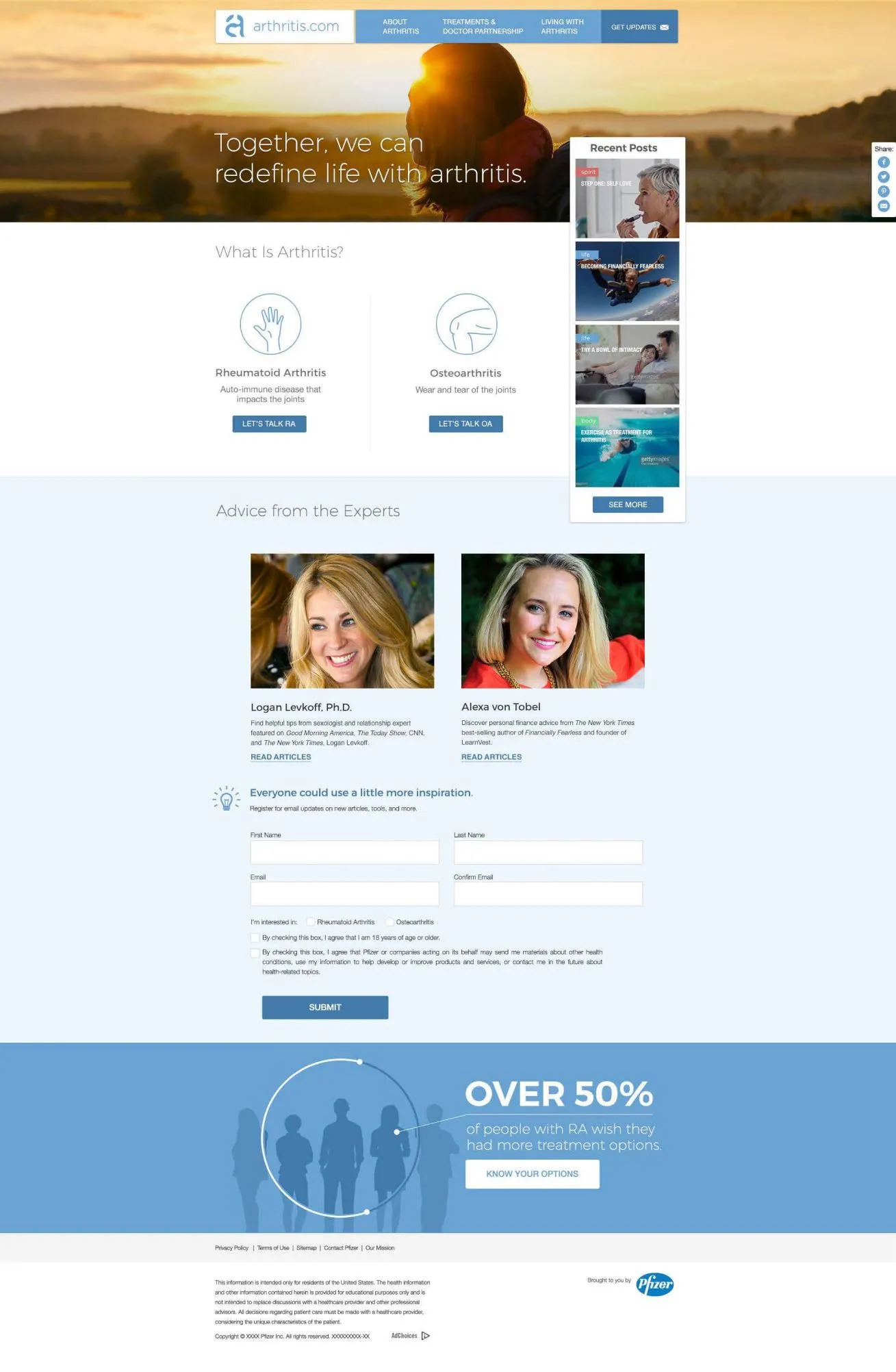
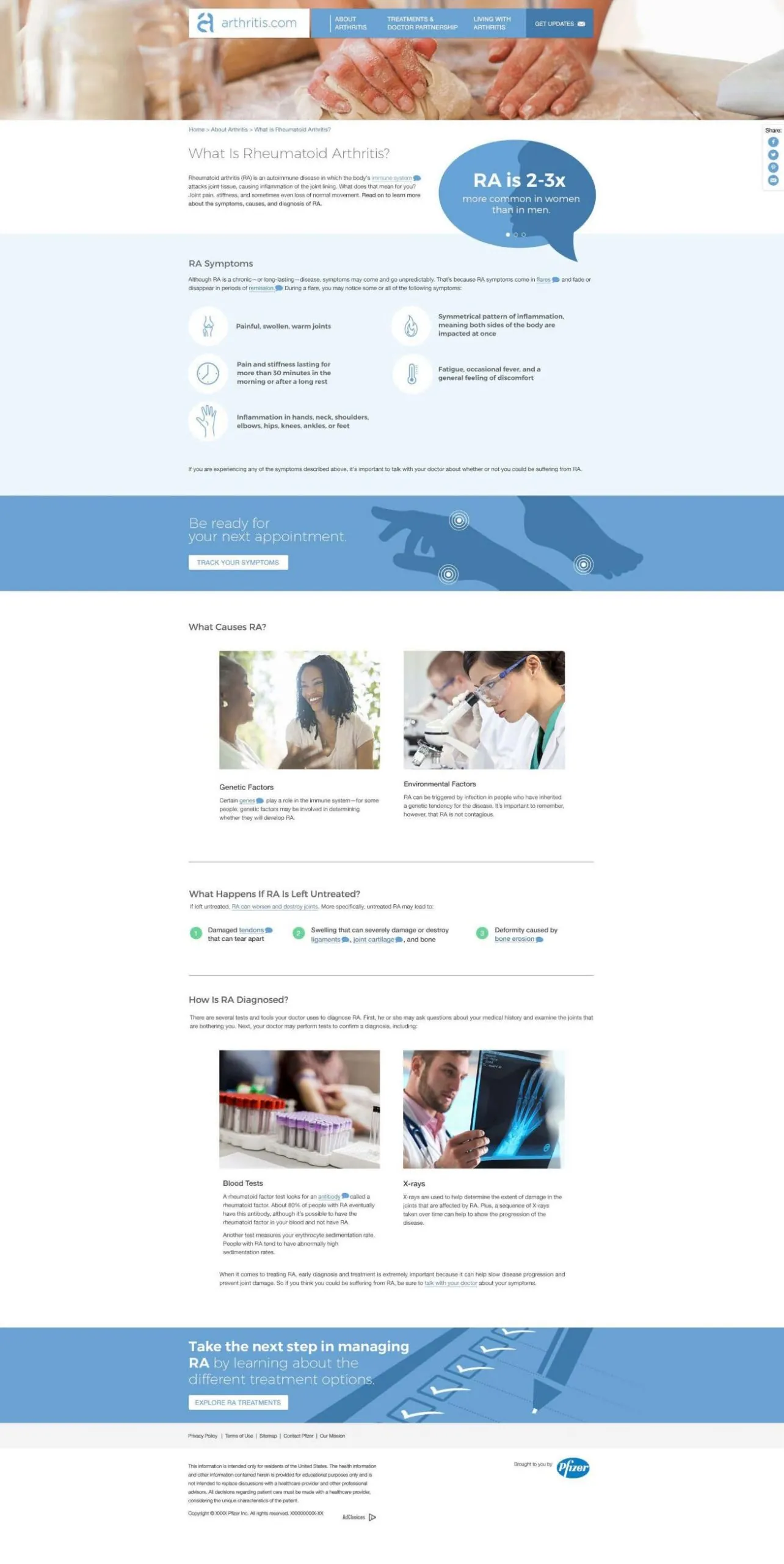
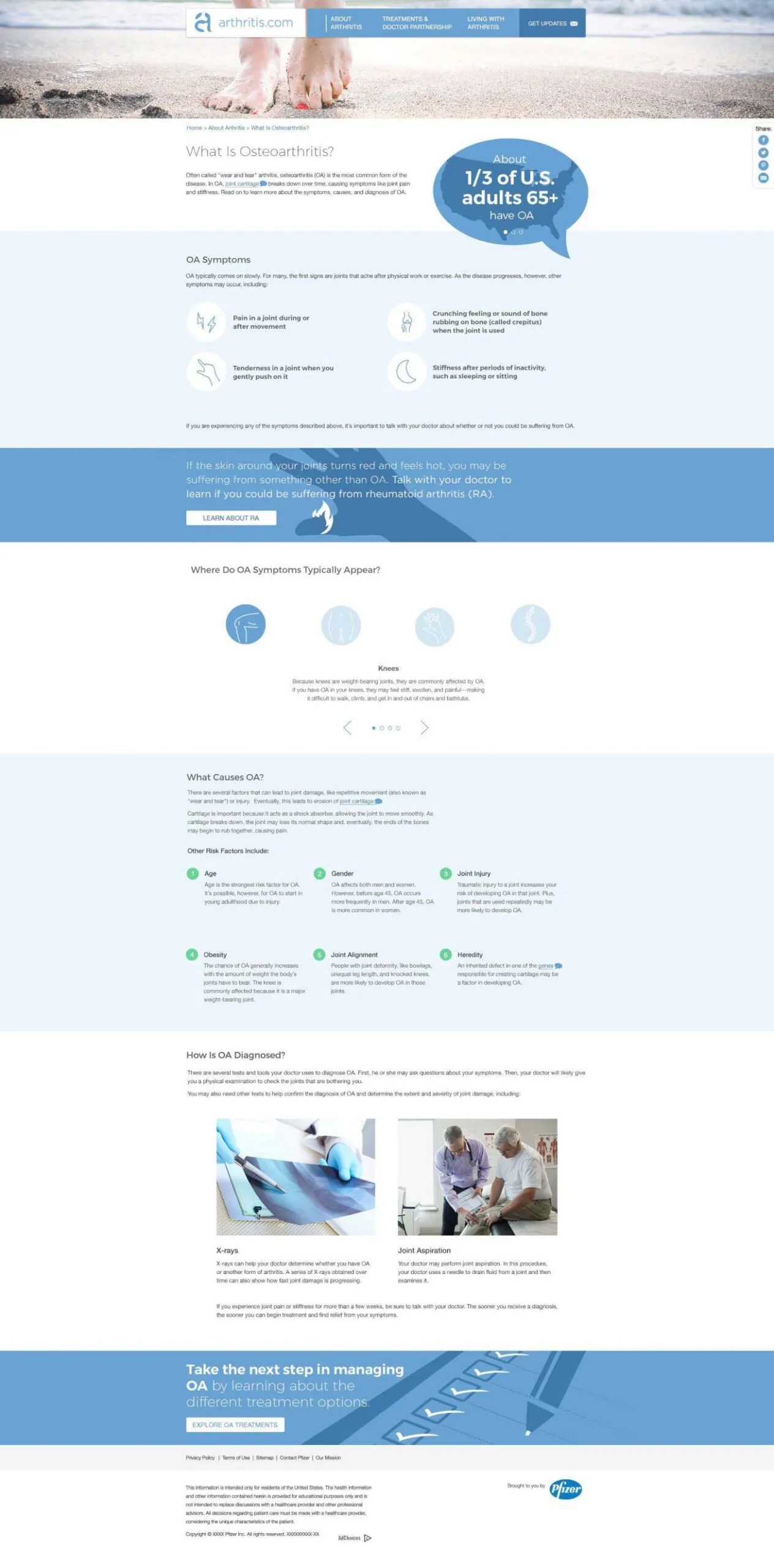
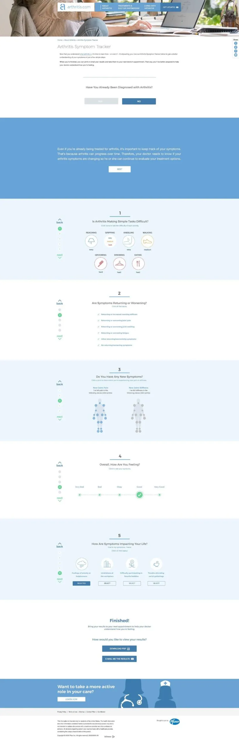
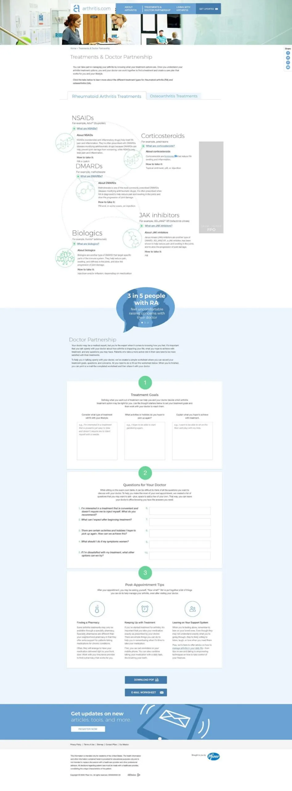
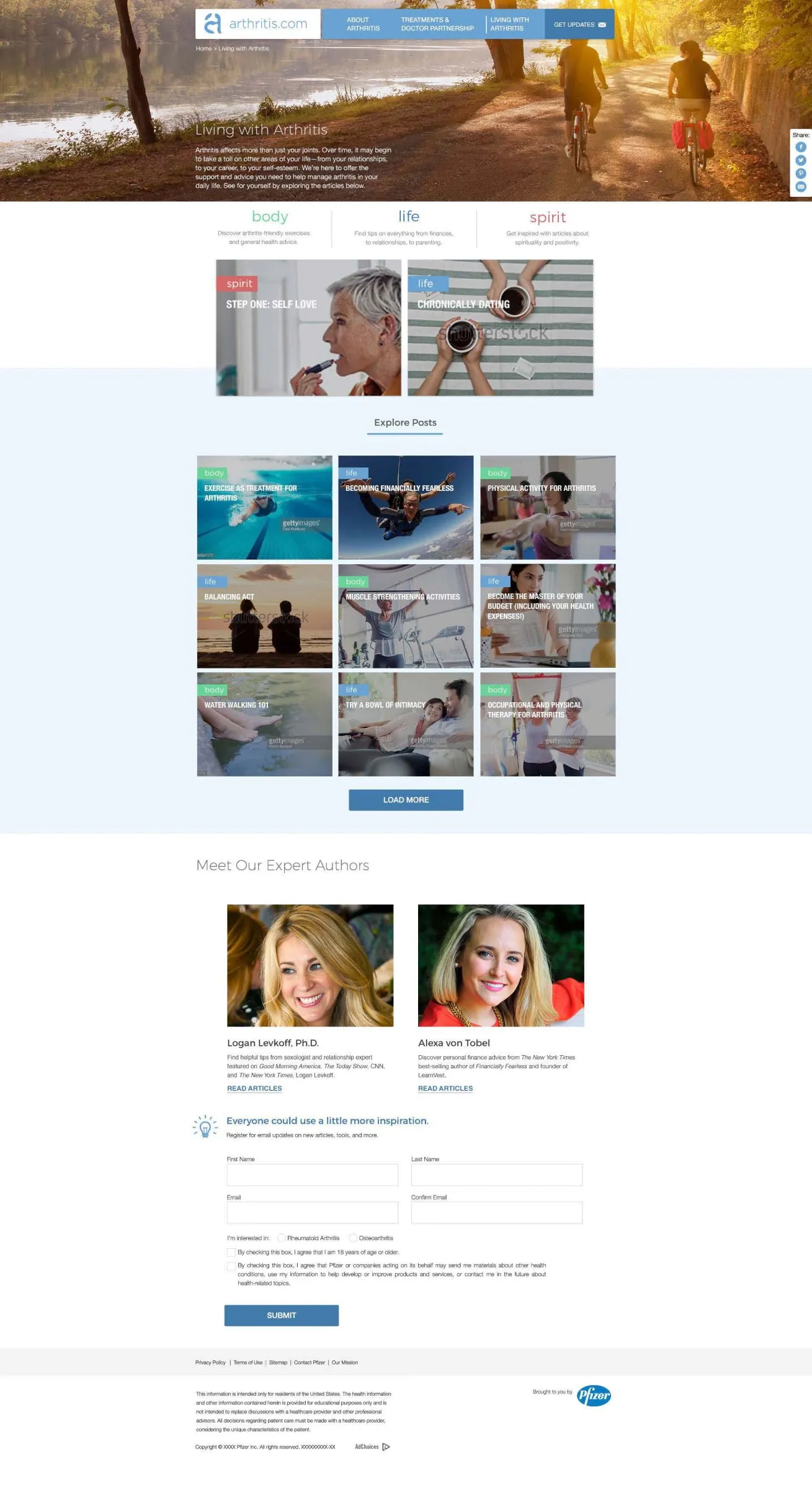

From PDF to JIRA
Handoffs used to be annotated PDFs, followed by hours of meetings to agree on what they meant. I moved handoff into JIRA: global elements and main pages became epics, and details became stories. QA got easier, and the offshore developers got clearer direction.
Measuring success
Bounce rate fell from 60% to 33% year over year, and visits grew from 4 to 6 minutes. Visits also grew quarter over quarter, and mobile engagement rose sharply once the site was fully responsive. Hotjar, with user data anonymized under Pfizer’s privacy rules, showed how people actually used the site.