Pfizer
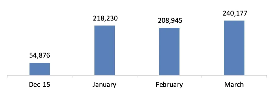
Registrations grew from 54k before launch to 218k after it. Over two years, I built the prototype for in-person patient testing, championed responsive, atomic design through Pfizer’s review process, and handed offshore developers a 70-page spec.
- Role
- Associate Director of User Experience
- Team
- Art directors, copywriters, offshore developers
- Engagement Length
- 2 years
- Tools
- Omnigraffle, Sketch, GA, Hotjar
- Pfizer
- XELJANZ is used to treat adults with moderately to severely active rheumatoid arthritis when 1 or more medicines called tumor necrosis factor (TNF) blockers have been used and did not work well or cannot be tolerated.
Problem
xeljanz.com didn’t work on phones, covered only one indication (rheumatoid arthritis), and ran on outdated content. Patients had no tools to judge whether the medication fit their needs.
Outcome
Over a multi-year engagement, we rebuilt xeljanz.com from the information architecture up, starting with live user testing. The responsive site met every legal and compliance requirement, introduced new ways to present Important Safety Information, and was built to take on future indications.
- increase in return visitors navigating to the Registration page
- 47%
- lift in mobile registration completion rates
- 31%
- registrations after launch, up from 54k before
- 218k
Why are we doing this?
Business Side
- Drive patient requests for Xeljanz by educating, engaging, and activating patients
- Reach the DMARD audience with the brand’s key differentiators
- Make key information quick to find on mobile, tablet, and desktop
Customer Side
Rheumatoid arthritis (RA) is a chronic disease that inflames the joints. Patients need to understand what joint damage means for their health and daily life, and how treatment options progress, so they can make informed decisions.
User Testing
I joined the brand at user testing. With an external agency, I built the prototype for in-person sessions with RA patients in New York and San Francisco.
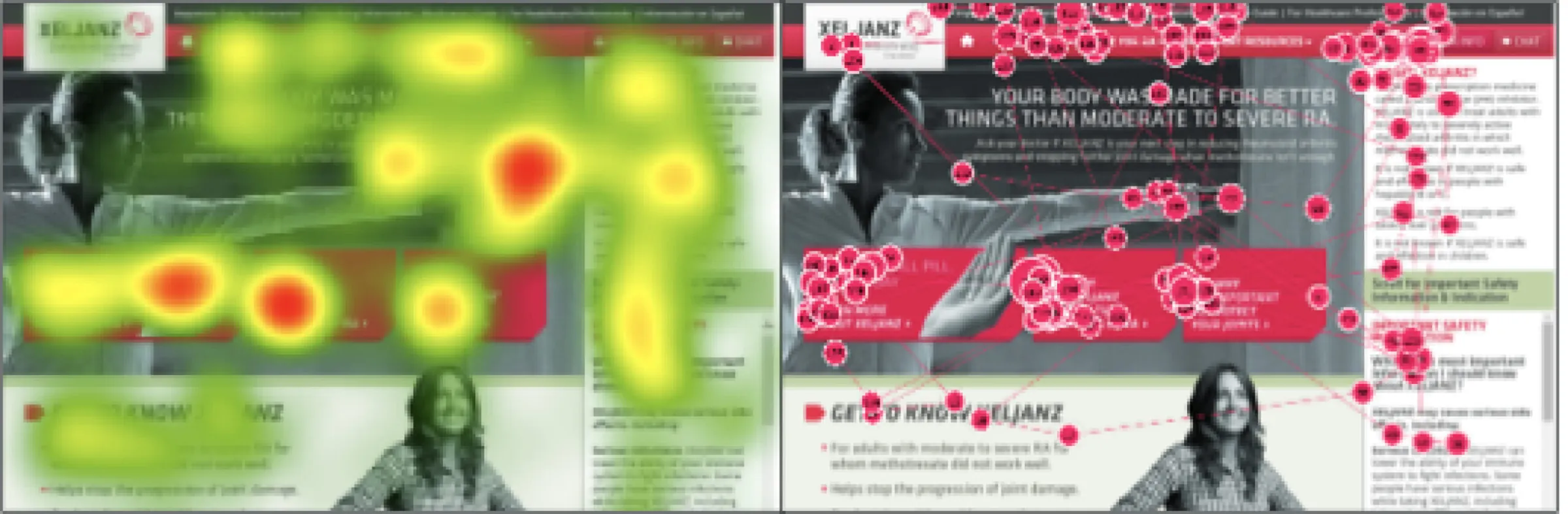
The study checked functionality, navigation, and content against a new focus: patients on conventional oral DMARDs.
What we learned:
- Patients liked the proposed “tall-boy” pages that scroll instead of click.
- Primary CTAs on the hero pages worked as expected.
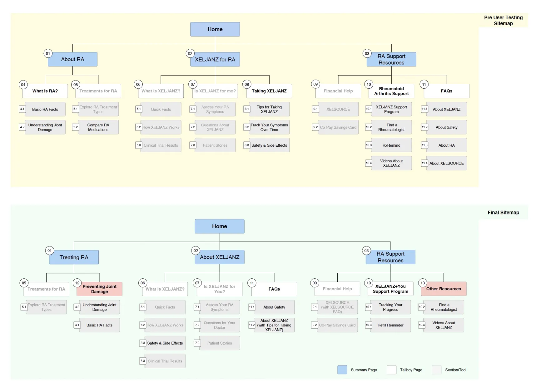
- The information architecture was intuitive but needed changes to labels and organization.
Introducing Responsive to Pharma
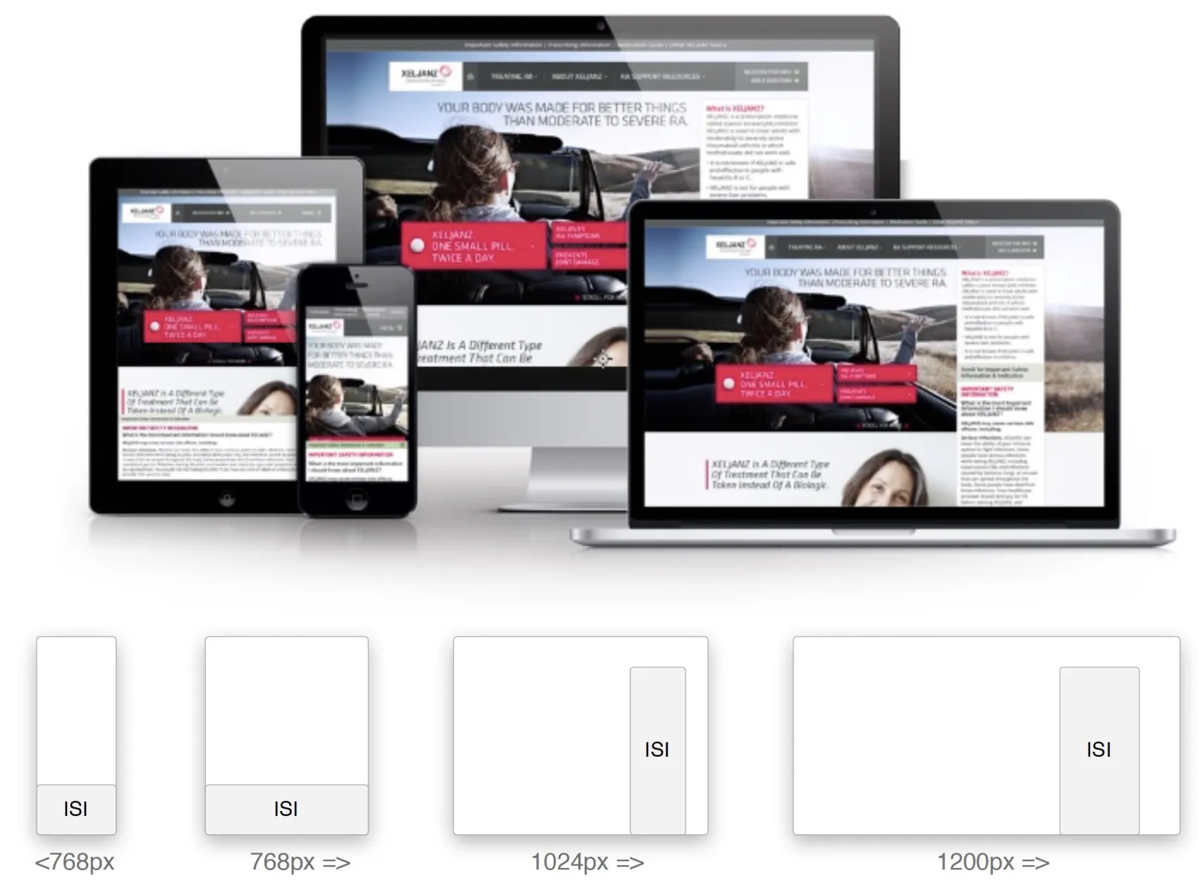
When the work began, companies were moving away from separate “m.” sites. Responsive meant a larger initial scope but was the sounder long-term choice, so I championed it with Brad Frost’s Atomic Design, inside the agency and with the client, including Pfizer’s strict Review Committee.
Pfizer strictly required Important Safety Information (ISI) to take up to 20% of the usable screen.
Mobile First but Not Really
The client team had little time and little interest in UX detail. So I wireframed mobile and desktop together, presented desktop, and showed both layouts only for the components that were hard to get right.
Fewer templates, shared components
Figma hadn’t launched yet, Sketch was just catching on, and the design team worked in Photoshop. With the art directors, I cut the number of templates the site needed and standardized its components and styles.
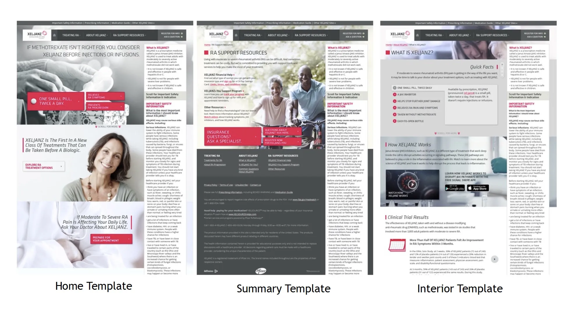
Client and Regulatory Approvals
Every page had to pass Pfizer’s Review Committee (RC) for factual accuracy and compliance with law, regulation, and Pfizer policy, and the RC reviewed the site as a PDF. So all text and images had to sit in their final layout, approved internally and by the client, before review. Mistakes meant delays and rework, so the copywriters, art directors, and I audited every asset for consistency first.
Working with Offshore Developers
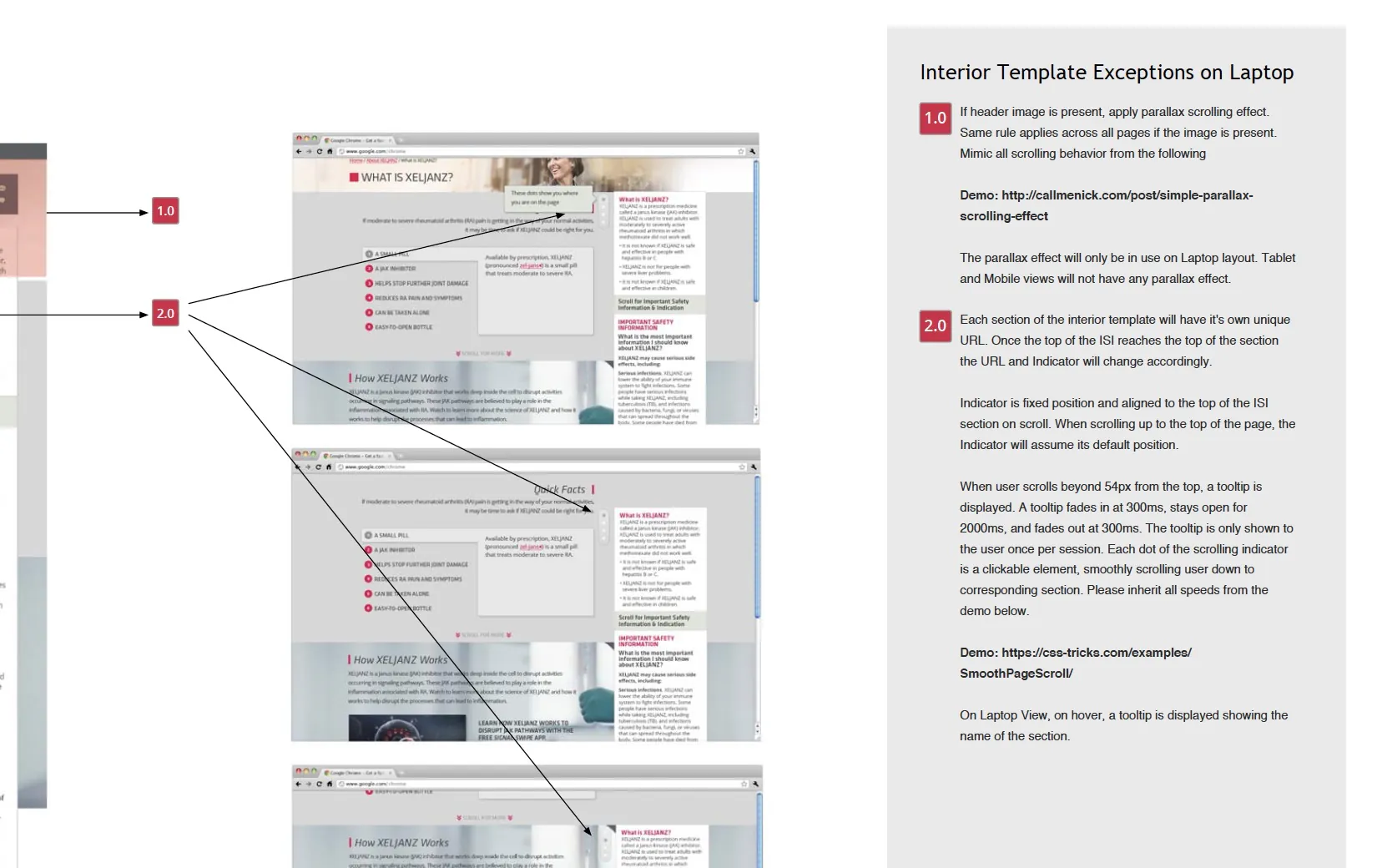
I wrote a 70-page functional specification with clear guidance, examples, and hand-coded demos. I ran weekly calls with the offshore developers, answered open questions asynchronously, and asked for in-progress reviews so nothing surprised us at the end.
Measuring success
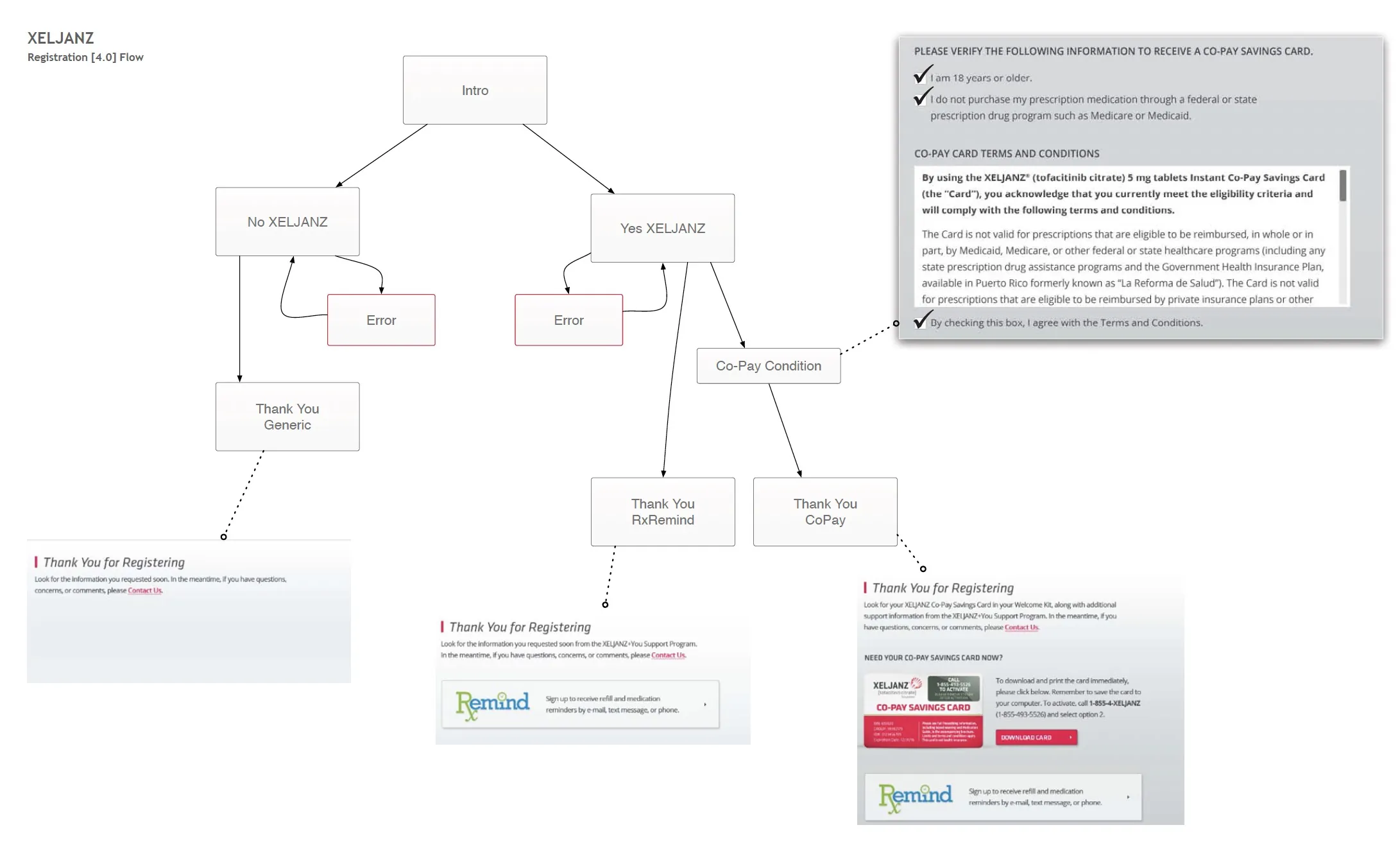
Return visitors reaching the Registration page rose 47%, and mobile registration completion rose 31%. Registrations grew from 54k before launch to 218k after, and registration that worked on every device was a big part of that.